
In this post, I will show how you can present user input validation errors to the user. By default, WPF shows a red border around the TextBox when the entered value is invalid. But in this case, our user has no idea what is wrong with entered data. We need to inform the user by providing an error message on the view.
To show you available option I created a sample project. You can find it under the link: https://github.com/kmatyaszek/WPFValidationDisplayErrors
In our sample project, we have four TextBox elements. Each of them presents a different style of presenting the occurred error to the user. When an error occurs (user entered value equals test) on the data binding the attached property Validation.HasError property is set to true on the target element of the data binding process (in our case it’s TextBox element). So we can use this property to indicate if the value entered by the user is invalid. We also can use Validation.Errors attached property to retrieve error message.
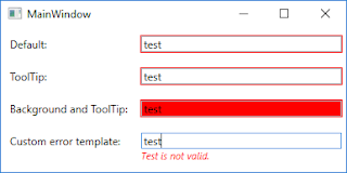
Below you can see the output of our sample project. As you can see when I typed value test to each of the TextBox each of them shows me an error message in the different form.
In this example, I focused on presenting the error message to the user so I decided to use the ValidatesOnExceptions mechanism (to read more about this please go to the following link: WPF Validation - Using ValidatesOnExceptions). Let’s look at the source code especially on XAML code.
<Window x:Class="WPFValidationDisplayErrors.MainWindow"
        xmlns="http://schemas.microsoft.com/winfx/2006/xaml/presentation"
        xmlns:x="http://schemas.microsoft.com/winfx/2006/xaml"
        xmlns:d="http://schemas.microsoft.com/expression/blend/2008"
        xmlns:mc="http://schemas.openxmlformats.org/markup-compatibility/2006"
        mc:Ignorable="d"
        Title="MainWindow" Height="200" Width="400">
    <Window.Resources>
        <Style TargetType="Label">
            <Setter Property="Margin" Value="5" />
            <Setter Property="VerticalAlignment" Value="Center" />
        </Style>
        <Style x:Key="DefaultTextBoxStyle" TargetType="TextBox">
            <Setter Property="Margin" Value="5" />
            <Setter Property="VerticalAlignment" Value="Center" />
        </Style>

        <Style x:Key="ToolTipWithErrorMessageOnErrorStyle" TargetType="TextBox" BasedOn="{StaticResource DefaultTextBoxStyle}">
            <Style.Triggers>
                <Trigger Property="Validation.HasError" Value="True">
                    <Setter Property="ToolTip" Value="{Binding RelativeSource={RelativeSource Self}, Path=(Validation.Errors)[0].ErrorContent}" />
                </Trigger>
            </Style.Triggers>
        </Style>

        <Style x:Key="RedBackgroundOnErrorStyle" TargetType="TextBox" BasedOn="{StaticResource ToolTipWithErrorMessageOnErrorStyle}">
            <Style.Triggers>
                <Trigger Property="Validation.HasError" Value="True">
                    <Setter Property="Background" Value="Red" />
                </Trigger>
            </Style.Triggers>
        </Style>

        <Style x:Key="CustomErrorControlOnErrorStyle" TargetType="TextBox" BasedOn="{StaticResource DefaultTextBoxStyle}">
            <Setter Property="Validation.ErrorTemplate">
                <Setter.Value>
                    <ControlTemplate>
                        <StackPanel>
                            <AdornedElementPlaceholder x:Name="placeholder" />
                            <TextBlock FontSize="11" FontStyle="Italic" Foreground="Red"
                                       Text="{Binding ElementName=placeholder, Path=AdornedElement.(Validation.Errors)[0].ErrorContent}" />
                        </StackPanel>
                    </ControlTemplate>
                </Setter.Value>
            </Setter>
        </Style>
    </Window.Resources>
    <Grid Grid.IsSharedSizeScope="True">
        <Grid.RowDefinitions>
            <RowDefinition Height="Auto" />
            <RowDefinition Height="Auto" />
            <RowDefinition Height="Auto" />
            <RowDefinition Height="Auto" />
        </Grid.RowDefinitions>
        <Grid.ColumnDefinitions>
            <ColumnDefinition Width="Auto" SharedSizeGroup="Labels" />
            <ColumnDefinition Width="*" />
        </Grid.ColumnDefinitions>

        <Label Content="Default:" />
        <TextBox Grid.Column="1"
                 Text="{Binding Path=Default, Mode=TwoWay, ValidatesOnExceptions=True, UpdateSourceTrigger=PropertyChanged}"
                 Style="{StaticResource DefaultTextBoxStyle}" />

        <Label Content="ToolTip:" Grid.Row="1" />
        <TextBox Grid.Column="1" Grid.Row="1"
                 Text="{Binding Path=ToolTip, Mode=TwoWay, ValidatesOnExceptions=True, UpdateSourceTrigger=PropertyChanged}"
                 Style="{StaticResource ToolTipWithErrorMessageOnErrorStyle}" />

        <Label Content="Background and ToolTip:" Grid.Row="2" />
        <TextBox Grid.Column="1" Grid.Row="2"
                 Text="{Binding Path=Background, Mode=TwoWay, ValidatesOnExceptions=True, UpdateSourceTrigger=PropertyChanged}"
                 Style="{StaticResource RedBackgroundOnErrorStyle}" />

        <Label Content="Custom error template:" Grid.Row="3" />
        <TextBox Grid.Column="1" Grid.Row="3"
                 Text="{Binding Path=CustomError, Mode=TwoWay, ValidatesOnExceptions=True, UpdateSourceTrigger=PropertyChanged}"
                 Style="{StaticResource CustomErrorControlOnErrorStyle}" />
    </Grid>
</Window>
As you can see in the above code snippet we defined TextBox styles in the Window resources section. As I mentioned before to indicate if we should show error message we’re using attached Validation.HasError property. In the first row is presented default behavior of the validation errors in WPF, it only shows a red border around the TextBox. In the second row, I created a custom style to show an error message in the tooltip. In the third row, I added the background color if the value is invalid. And in the last row, I created custom error template to show error message right below TextBox.