DevExpress Themes supports painting of the most standard native WPF controls. The more complex native WPF controls are not supported but you can find a corresponding alternative DevExpress control insted.
Following list contains native WPF controls supported by DevExpress Themes:
- System.Windows.Button
- System.Windows.CheckBox
- System.Windows.ComboBox
- System.Windows.ComboBoxItem
- System.Windows.Expander
- System.Windows.GridSplitter
- System.Windows.GroupBox
- System.Windows.Label
- System.Windows.ListBox
- System.Windows.ListBoxItem
- System.Windows.Page
- System.Windows.ProgressBar
- System.Windows.RadioButton
- System.Windows.Controls.Primitives.ScrollBar
- System.Windows.ScrollViewer
- System.Windows.Separator
- System.Windows.Slider
- System.Windows.TabControl
- System.Windows.TabItem
- System.Windows.TextBox
- System.Windows.Tooltip
- System.Windows.TreeView
- System.Windows.TreeViewItem
If you want to disable DevExpress theming on native WPF control you can set attached property dxc:ThemeManager.ThemeName to value None. You can apply this attached property to a particular container or control. If this property is applied to container all its child inherit this setting.
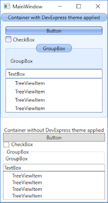
Below example presents two containers. One of them inherits theme from global application theme (all its children are using DevExpress theme). The second one using the attached property dxc:ThemeManager.ThemeName disables theming mechanism.
<Window x:Class="WpfApp1.MainWindow"
        xmlns="http://schemas.microsoft.com/winfx/2006/xaml/presentation"
        xmlns:x="http://schemas.microsoft.com/winfx/2006/xaml"
        Title="MainWindow" SizeToContent="WidthAndHeight"
        xmlns:dxc="http://schemas.devexpress.com/winfx/2008/xaml/core">
    <Grid>
        <Grid.RowDefinitions>
            <RowDefinition Height="*" />
            <RowDefinition Height="20" />
            <RowDefinition Height="*" />
        </Grid.RowDefinitions>

        <GroupBox Header="Container with DevExpress theme applied">
            <StackPanel>
                <Button Content="Button"/>
                <CheckBox Content="CheckBox"/>
                <GroupBox Content="GroupBox" Header="GroupBox"/>
                <TextBox Text="TextBox"/>
                <TreeView>
                    <TreeView.Items>
                        <TreeViewItem Header="TreeViewItem" />
                        <TreeViewItem Header="TreeViewItem" />
                        <TreeViewItem Header="TreeViewItem" />
                        <TreeViewItem Header="TreeViewItem" />
                    </TreeView.Items>
                </TreeView>
            </StackPanel>
        </GroupBox>

        <GroupBox Name="gbControlsWithoutDevExpressTheme" Header="Container without DevExpress theme applied"
                  Grid.Row="2" dxc:ThemeManager.ThemeName="None">
            <StackPanel>
                <Button Content="Button"/>
                <CheckBox Content="CheckBox"/>
                <GroupBox Content="GroupBox" Header="GroupBox"/>
                <TextBox Text="TextBox"/>
                <TreeView>
                    <TreeView.Items>
                        <TreeViewItem Header="TreeViewItem" />
                        <TreeViewItem Header="TreeViewItem" />
                        <TreeViewItem Header="TreeViewItem" />
                        <TreeViewItem Header="TreeViewItem" />
                    </TreeView.Items>
                </TreeView>
            </StackPanel>
        </GroupBox>
    </Grid>
</Window>
Below you can see the output of this example application.

You can also disable DevExpress theme mechanism in code-behind invoking the following method:
ThemeManager.SetThemeName(gbControlsWithoutDevExpressTheme, Theme.NoneName);

